
UCSB Website
Project at Part-time Job
Duration: 2021-2022; 9 months
Role: Instructional Media Designer(UI/UX design) in a team of 4; 1 instructional consultant, 1 programmer, 2 instructional media designers
Skills: UI/UX design, HTML, CSS, Content Management


Details
Overview
The Instructional Development(ID) of UC Santa Barbara(UCSB) is the unique one-stop shop on campus to help with almost any aspect of teaching. It helps all kinds of instructors including teaching assistants, faculty, and more with pedagogy, instructional design, and research on teaching and learning as well as instructional technologies. It also provides campus-wide support for events, video and audio productions, photography and more.
However, though ID provided extensive and diverse kinds of services, the old website of ID was not service-oriented. Instead, it was more an introduction to the department and display of its productions. People seeking for services from ID wasted time and effort on finding the channel to request help. Moreover, the interface of the website was very different from the rest of the UCSB websites, which made it difficult to navigate the ID website as it did not align with the flow of the rest. It was not aligned with the UCSB branding either. Therefore, ID would like to renovate their website in order to provide a more straightforward and easier route to their services as well as give the department a fresh new image.
This redesign project took nine months to complete with a team of four - one instructional consultant, one programmer, and two instructional media designers. The instructional consultant acted as the project manager and was also in charge of coordinating the writing of the content. The two designers were responsible for frontend: the user experience and interface design. The programmer focused on the backend.
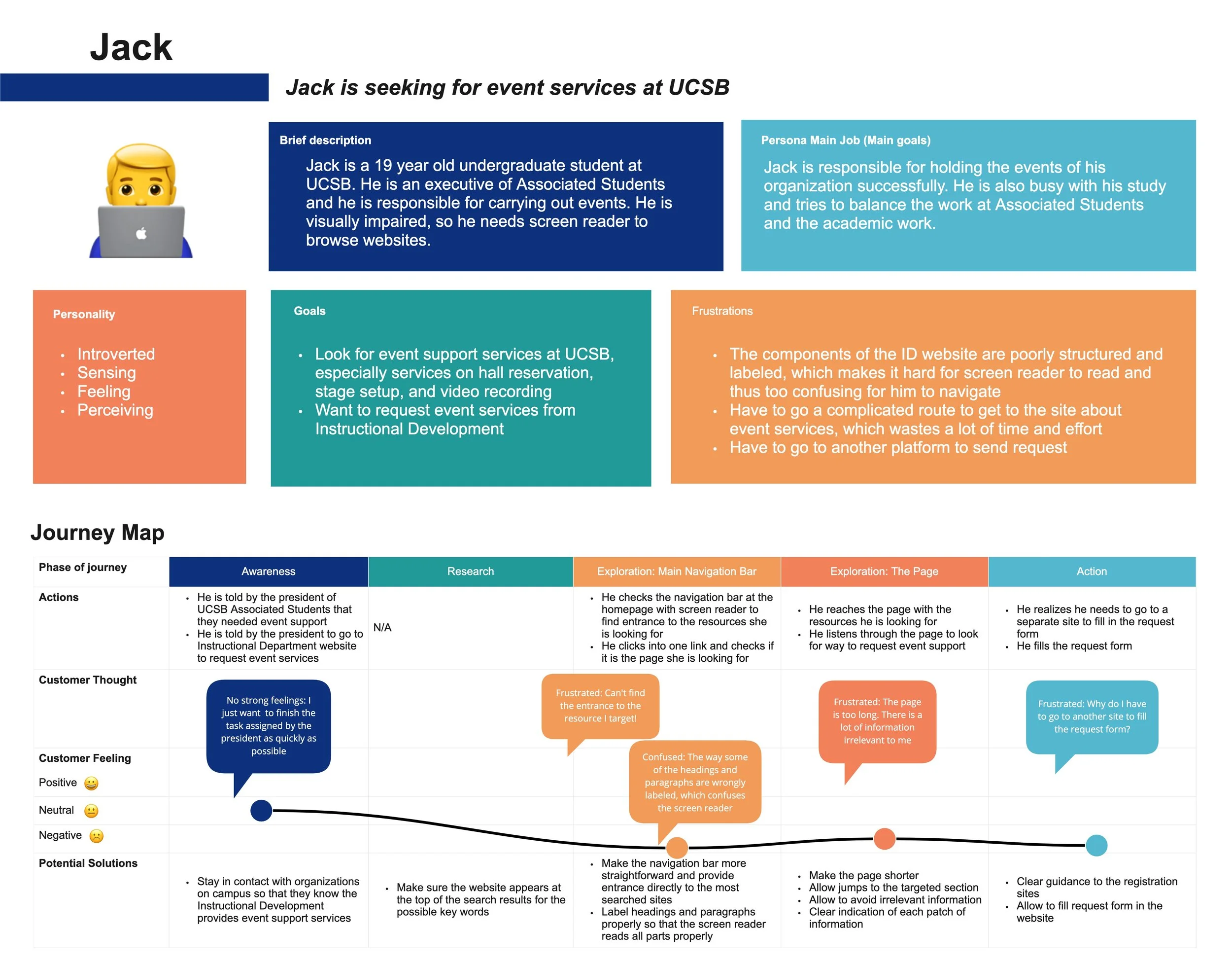
User Personas
Three personas were made after extensive surveys and interviews with people who often seeked services from ID. The personas informed the team that the biggest opportunity for the website improvement was to: (1) innovate the navigation bar and provide entrances to the major services of ID; (2) make pages shorter; (3) make it easier and quicker to browse for information; (4) make it possible to request services in the websites.


Wireframe & User Flow - Route to Teaching Resources Page

Straightforward entrances and multiple routes leading to the key resource.
Outcome

The primary navigation bar provided entrances directly to the 6 main types of services ID provided, which were “teaching”, “classroom services”, “event services”, “video services”, “photo services”, and “AV installation”. This significantly reduced the time and effort it took to find the pages with the resources.

There was an “ask for help” page for the 4 main types of users. In this way, users could directly message the department to ask for help if the information on the website could not solve their problems.
1. The Service-oriented
Needs Analysis

2. Easier Reading & Searching


Accordions were used to hide detailed information in order to shorten the page and thus reduce the time needed for reading. Descriptive titles were applied for the accordions so that it was easy for users to identify the information they needed and read the details.
Background of different colors was used to make it easier for users to differentiate different sections of the content.
3. Align with UCSB Branding


UCSB colors and fonts were used on the website in order to be aligned with the branding guidelines of UCSB.
4. Engaging Experience


Media such as videos and images were used along with the text to illustrate the content and create more engaging experience.
5. Easy Request & Checking


The embedded Google forms allowed users to submit service requests directly on the website without going to other platforms to do extra steps.
The embedded forms allowed users to check in real time whether specific equipments were available in specific classrooms or halls.